—Naomi Karyamsetty
Depending on whom you ask, handlettering is either an archaic, obsolete habit or a thriving creative field. At its core, it involves putting words on paper ✨aesthetically✨. Its origins, in the distant mists of time, involve a 6th standard kid with half-decent handwriting and a brain filled with pop song lyrics. Adopting a slightly broader meaning-making apparatus, handlettering is a broad term used to refer to both traditional calligraphy (think ancient illuminated manuscripts and dip pens from historical films) and modern calligraphy (which is anything from ‘faux’ to brush-pen to graffiti-style to arbitrary letterforms that people draw for some reason instead of using fonts like normal people).

To pick up hand lettering, you need the following highly expensive and rare-sourced tools:
- A paper
- A writing instrument
- A steady supply of words or phrases
- A desire to appear awake, and preferably aware of one’s surroundings, in class
(For best results, situate yourself at the back of the classroom, and not in the first fricking bench, as I did. I think this should easily translate to online classes, F.)

Aside from being relatively easy to pick up (we know the alphabets; how hard can this be), it’s a way to showcase the words and their power—something students of this department can relate to, especially the power with which accumulated course readings hit you in the face during quiz week. It’s also an easy ‘artistic’ out for people who (like me) are bad at drawing. If you are a good drawer, you have a head start because firstly, you already know how to hold a pencil, something most of us last did in primary school; and secondly, illustrations can combine with lettering to create very eye-catching pieces.
Immediate returns include a sudden usefulness in making birthday cards, bookmarks, or other small gifts. You can also waste invest time in making annoyingly perfect class notes.
The main intention of my lettering, though (when it’s not procrastination or relaxation), is the approach I bring to graphic design in general—how best to communicate a message. The aesthetics, colour choice, and other graphic elements are important, and worth exploring in their own right; but for me the motivating factor has always been: hey, I like this quote (usually from an overplayed song); how can I show people why I like it? (This is perhaps a side-effect of learning in the Shaastrang design trenches rather than in art school.) This, combined with a general lack of skill disguised as minimalism, influences my small and slowly-expanding oeuvre.
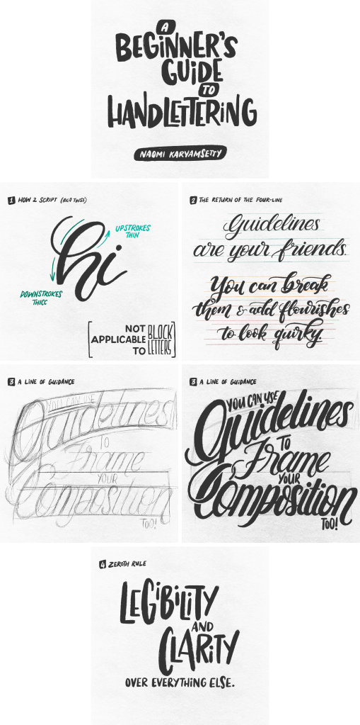
Here’s a very quick Lettering For Dummies:
(You’re free to disregard these rules, of course; but in my experience, rules are better broken after they’re first learned.)
If you want inspiration, a lettering ‘community’, and/or are interested in how people can possibly make money with this stuff, here are some resources to check out.
- Lauren Hom is a freelance lettering artist who’s done really cool professional work and has a passion for helping other creatives. Find helpful FAQs and lettering prompts on her website and Instagram account.
- Stefan Kunz is an established lettering artist who creates tools and classes for aspiring learners. Find more information about the letter builder set he created with Ian Barnard, as well as other tools, on his website. His Instagram is here.
- General gods of type: Ellen Lupton, who’s written TONS; Jessica Hische.
There are also lots of hardcore traditional calligraphers. To name a few (all links are to Instagram accounts):
- Ellie Haywood, who creates geometrical art with blackletter;
- the extremely versatile Sachin Shah;
- Hardik Singh, whose every piece is basically an illuminated manuscript; and
- Avinash Kharat, a meticulous copperplate artist who conducts workshops and is involved with Ori and Calli (website), a Maharashtra-based shop that has lots and lots of local lettering and origami supplies. (Fair warning: as a rule, art supplies are not cheap.)
There are many lettering communities who share prompt lists and work, often with overlaps, but I’ll mention two of the most popular here.
- Goodtype, founded by Brooke Robinson, celebrates typographers and lettering artists from around the world, and releases weekly prompts. (Website, Instagram.)
- 36 Days of Type, started by Nina Sans and Rafa Goicoechea, is an annual project where people create artwork with the characters of the Latin alphabet (A to Z and 0 to 9), one character a week. (Website, Instagram.)
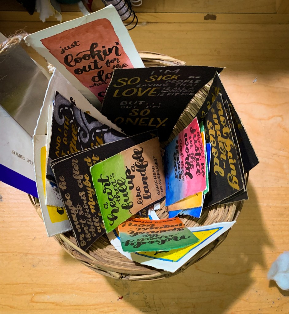
Last images dump. (I saved the pretentious digital art for last because I know firsthand how bad gadget envy is. You don’t need a fancy tablet, I promise.)

Naomi, from the HS15 batch, will hopefully graduate soon with an integrated MA in Development Studies. She is currently doing a graphic design internship which has probably ended by the time you read this. She also hopes you are kind to yourself and to others around you, especially during these Unprecedented Times™. She lives on Instagram at @nyomkitten and @naoms.letters and on Twitter at @nyomkitten, and replies to messages when she has enough bandwidth to.
Edited by Abhirami G
